Analogous Colors
Definition and Overview
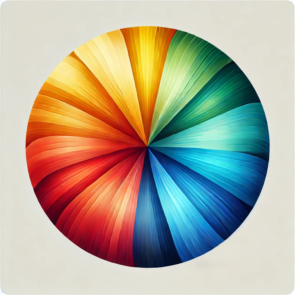
Analogous colors sit next to each other on the color wheel, sharing a common hue. This harmony creates pleasing visuals and a sense of unity in design.
Historical Context of Origin
Initially defined in color theory by artists and scientists in the 18th century, analogous colors have been utilized in various artistic movements, emphasizing harmony and unity.
Key Characteristics or Features
-
- Colors are adjacent to the color wheel.
-
- Create a harmonious and cohesive palette.
-
- Often used to evoke specific moods or feelings.
Notable Examples of Figures
Artists like Claude Monet often used analogous colors in their landscapes, creating depth and mood through subtle variations.
Interesting Fact or Anecdote
Did you know that nature often employs analogous colors? Think of the colors in a sunset, where the reds, oranges, and yellows blend seamlessly.
Visual Illustration or Imagery Suggestions
Consider including a color wheel highlighting analogous colors or a painting that effectively uses these colors.
Modern Relevance or Application
In contemporary art and design, analogous colors are commonly used in branding and advertising to convey emotions and create memorable visuals.
Related Terms or Concepts
Related terms include “complementary colors,” opposite on the color wheel and can create dynamic contrasts.
Quotes or testimonials
Artist Vincent van Gogh said, “Color is the keyboard, the eyes are the harmonies, the soul is the piano with many strings,” emphasizing the emotional power of color combinations.
Interactive Element or Prompt
What are your favorite color combinations? Try creating a piece of art using only analogous colors!
Check out the Adobe resource related to the harmony of colors
This visual represents an analogous color wheel with adjacent colors smoothly blending into each other.

